Distribution of Income
Distribution of Income
Having delved into the data sources and parameters used in the discussion on income distribution in the last Chapter, the methods of analysis and conclusions has to be examined more carefully here.
In this section we delve into the analysis of the changes in the distribution of income over time. The question of mobility of income and what is the assessment of all data will be covered in Chapter 4 and 5.
Much has been said about this topic, about how the rich are exploiting the poor and variations on that theme. However the data shows certainly a more complex and a different story, a necessary one to comprehend before considering what if anything to do about it.
How poor are the poor? How does the middle class fair in all of this? Within the rich, how does the income become distributed over time? What is the comparison to other countries? What do various government agencies say about the income trend? How do the various factions assess this data? How does healthcare costs rising so much affect income to all groups? - Attempt is made here to answer these and more questions.
Patience and deliberation is key to understanding
this complex issue.
Outline
Income Distribution Page
Chapter 1: Data Sources and Validity
Chapter 2: Income Distribution
Chapter 3: Define Terms like Poor
Chapter 4: Income mobility
Chapter 5: Critical forces acting on us
Chapter 6: The Occupy Movement
Chapter 7: Buffet Rule fair?
Chapter 8: Conclusions
What is the distribution of income over time?
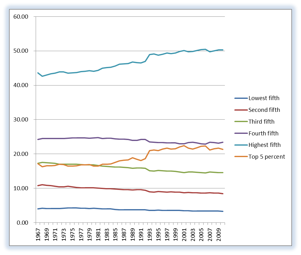
Perhaps the best way to show the income distribution over time is to display 2 graphs, one of percent share and the other of median income. The percent share is taken from the Census Bureau data and is simply computed using percent of total income before taxes and any transfer payments. The data clearly shows that the percent share does increase at the high-end, but relatively gradually. The growth in the highest Quintile is driven primarily by the growth in the highest 5%, which we will see is driven by the highest 1% and even higher.
The other quintiles are even flat or slightly negative in slope as the year approaches 2010. One could easily stop here and say that the rich are getting richer faster, and that would be true. Some will now be inclined to utter "ah-hah, I knew this was right." But in so doing you would miss the point of this exercise, and that is to truly understand what is happening here, and what is driving it.
One must also say that since the average income is rising in this time period that everyone is better off than they were before. Which takes us to the 2nd graph covering just 1991 to 2010.
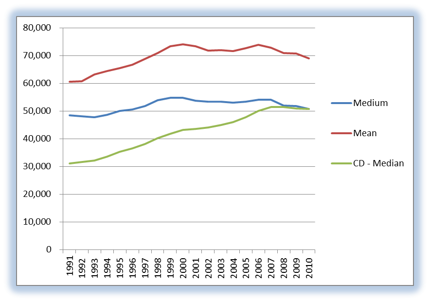
The graphs at left show the mean and median incomes in 2010 dollars and the median in current dollars. Showing both is relevant as was shown in the data Chapter. Any conclusions thus far: the rich are getting richer and everyone is better off.
If the actual people in each quintile were fixed and the number of households were relatively constant then you would say that the GDP increase seen over this time period did not relate well to the income distribution. But as we will show in the Chapter on mobility of individuals between quintiles has been high.
Also the number of households is not near being constant during this period. Actually the number of households nearly doubled over this time period (see Census Bur spreadsheet). The ratio of households to the total population also increased druing this period from 0.3 to 0.4, meaning a higher percentage of the work force went to work. This does seem to correlate to women entering the work force at a higher percentage and not in a household.
Since some portion of the population that newly entered the workforce begins in the lowest quintile that would certainly affect our conclusions. This is one of the forces operating on the general public we will return to later.
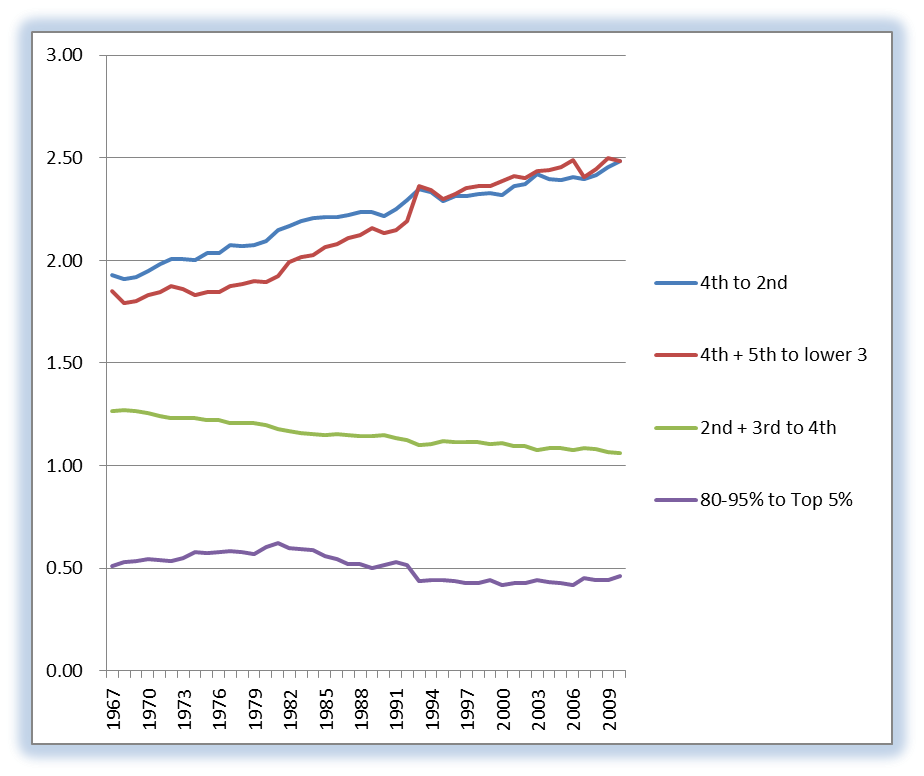
We can also compute the ratio of quintiles to each other. See the graph below.
This graph at right shows various groupings of quintile incomes ratioed with another grouping. The 5th is the highest and the 1st is the lowest income quintile. The ratio of the 4th plus 5th to the lower 3 would indicate a movement of income to the higher quintiles, but the ratio of 2nd plus 3rd to the 4th indicates the income is not just shifting up but is moving towards the 3rd. In any event the middle class is doing well here and that the numbers are not changing rapidly.
We have to also recall that this is before taxes, and since the higher quintiles do pay more tax and the lower quintile receives transfer payments then the conclusion is even more equality than is commonly stated.
From Reason: The Facts About Income Inequality:
The point is that there are many pitfalls in the income stats if you don’t know to look for them. For example, people often unknowingly compare apples and oranges, say, household income in two different periods with average households of different sizes. If single-earner households take the place of two-earner households, an unadjusted comparison could be highly misleading. (The growth in the number of households has been outpacing population growth.)
How Poor are the Poor?
How poor are the poor? Well data on consumption begs further the statement raised above: the poor do make progress in income but actually make more progress in consumption. For a preview of what this means, view the video at right.
As the next Chapter promises even the definition of the poor will be reviewed and in so doing raise again the question about the poor getting poorer. As we saw above by looking at the lower quintile which contains the group defined as poor the average income is not increasing as much. However that is but part of the story, as we are learning.
If the approach of adjusting the CPI rate for the poor is correct then what we are seeing in the graph at left is a realization that the poor in this definition amounts to something less than 5% or around 3.5% of the total population currently of 300 million total population. In other words less than the 11 to 14% that is the official number over time. The government is quite generous with this definition, as we will see in the next Chapter.
This is a good deal less than the 48 million currently collecting food stamps, so the total redistribution of income is not entirely based on a definition of poor that is defendable.
The consumption habits of the country have changed certainly in this time period. Buying a TV set in 1960 in current dollars would result in today's dollars with the purchase of a good many more electronic items.
Certainly electronics is the one industry that has seen the most competition perhaps, even the regulated and subsidized food industry has seen a reduction in the % of GDP drop form 17% in the 60's to 5% currently, doing the exact opposite of healthcare.
How free each market segment is in the economy and how buying habits change within each quintile is quite dynamic and does relate directly to the quality of living.
How are the rich doing in all of this concern
about income all going their way?
Mercatus, Reference
Veronique de Rugy
Clearly the rich are doing well in this time period, but what part of the rich seem to be doing better? The top 20% has seen an increase in percent income from low 40% to nearly 50% in this time period. Given the forces of the growth of high tech and all of the financial perturbations this increase is not so outrageous. Also since 1994 the income distribution has not changed much.
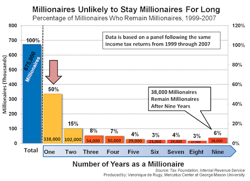
Something quite apparent in the graph at right is the rate of change of being a millionaire is quite high. In the year after being a millionaire 50% a can no longer claim to be so. This high rate of mobility is an important piece of this puzzle and part of the complexity.
Within the rich or top few percent, how well does each increment do over time?
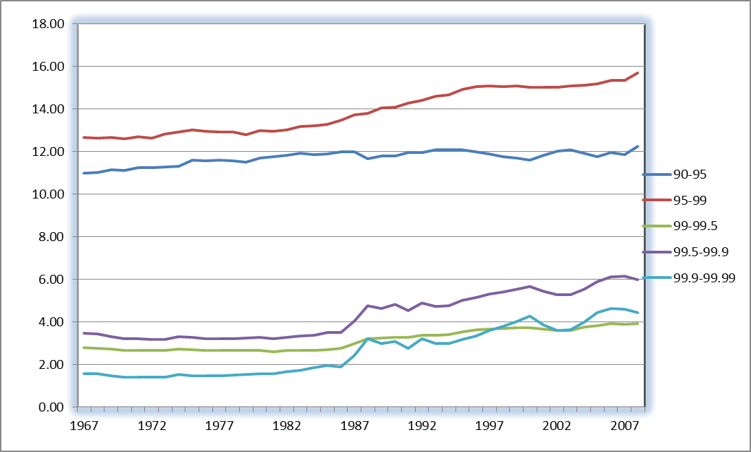
The graph at left shows how the very rich have increased their share of the total income over time. The group from 90 to 95% of the income tax units (remember it is Saez data) is essentially flat, with the top 5% gaining the most from the mid-80's on.
Of course with the change in the tax code and the reporting of more income from the 80's, this muddies this water a bit.
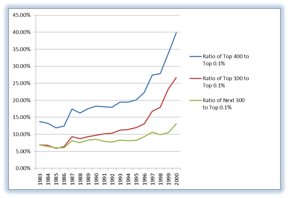
What we can say is that definitely the rich are getting richer faster, but not as fast as some seem to believe. The very rich, the top 400 are shown in ratio to the top 0.1% in terms of wealth share. The top 400 is formally defined as the top .0002% (approximately 400 people as total adult population.
Certainly the top 100 are driving the increase in this ratio. As we have a chance to see the makeup of this group as Forbes publishes it annually. In 2010 it was made up not of CEO's or rockstars, but either some owners (or founders) of businesses and some financial types.
The mobility of who is in this group is high, as we can see in the millionaire data above. During this time period from the early 80's to 2008 the growth of the top 400 was over a 2x increase in percentage. The names of the key names in Wal-Mart and Microsoft, Google, Facebook, Apple, among quite a few high impact companies with a very successful worldwide business.
There are also about 25% of these Top 400 were financial investor types: hedge fund and other fund owner/managers. George Soros, the well known liberal advocate, was one whose bets paid off in 2010 to the tune of an increase in wealth of an estimated $6B. One can say that this select group were made of up super achievers (owners or near owners), lucky and skilled financial gamblers (who won in one year to perhaps lose in another), and some odds and ends of old money. The first two dominate this group however, and in some cases the wealth was achieved by succeeding in a non-competitive industry, one strongly affected by government intervention, such as energy, and even finance.
There are a number of forces obvious operating here, strong worldwide competitive advantage, as well as some who deserve the crony label.
What more can we say about the Middle Class?
When we are discussing the middle class we can assume here that we are discussing the 2nd and 3rd and part of the 4th quintile. In other words about 50% of the households in this country. To address this we can delve into the effects of education and age. Examine the graphs below.
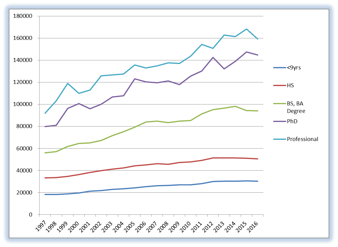
The graph on education shows that the slope is steeper over time, meaning that the higher the education the the higher the upside on average. Clearly in this time period of skill driven growth in the economy, affecting the Top 400 dramatically, makes the economy more dynamic and even the mobility between quintiles more apparent.
Having at least a HS education gives one the chance to at least have a good living, but not an easy one. The current statistic on HS dropouts is 1 million a year drop out with the ethnicities of Black and Hispanic being hit the hardest.
It should also be noted relative to the middle class that the total compensation must also include benefits like healthcare. As the healthcare costs have risen from 5% of the GDP in the 60's to something exceeding 17% in 2010 decade. Certainly if the cost of healthcare were kept at 5% of GDP then more than 60% of the money saved would have resulted in a 10% better wages for the middle class, or nearly $8 trillion dollars more compensation. This is sizeable over time.
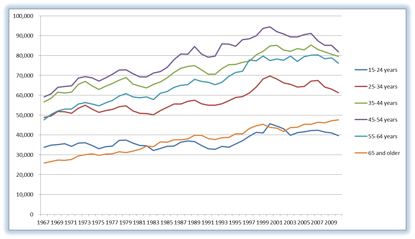
In the graph of share by age, it is apparent that the peak age of earning is 45. With an aging population, this will be put some downward pressure on the income of a higher percentage of the population. The entry level of 15-24 is consistently at a low level. In today's economy with the high unemployment rate of this age group, there will be a lower level. This however is data on households that are reporting. Some young folks who cannot find work, will continue living with their parents. Therefore it is also good to examine the effect of the number of earners per household.
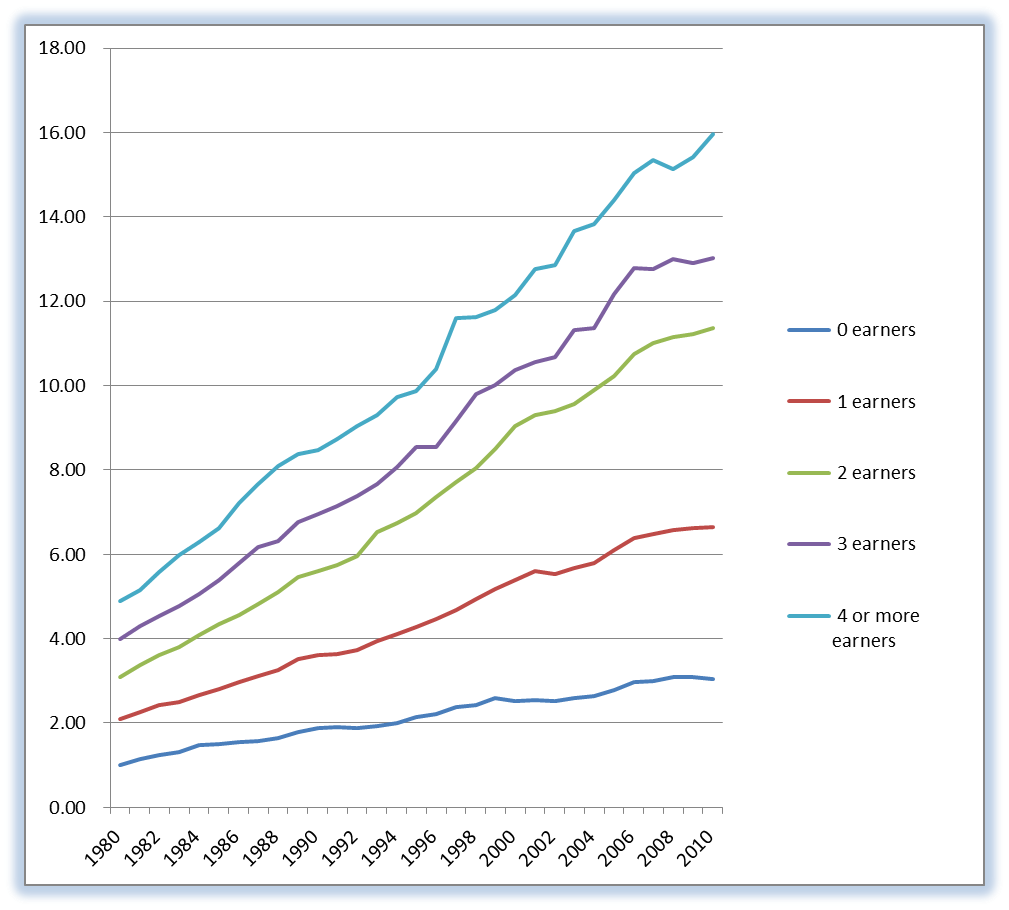
In the graph at right, the number of earners per household has a dramatic impact over time. Makes sense that with more earners per household that the income share can rise and will increase relatively over time.
If anything disturbs the size of a household over the various quintiles then this does affect the distribution of income. The size of households does tend to be larger at the higher income levels, and lower at the lowest level or quintile.
This is another aspect of using the data on income from both the IRS and the Census Bureau, as the size of the tax unit or the household is pertinent. Even if the divorce rate changes over the quintiles and over time it can affect any conclusions we can draw.
Again we are reminded of the complexity of income distribution and the premature nature of saying the rich are getting richer at the expense of the poor. If one worked at achieving a good education, balanced the relationships in the household to have all contribute, aged well in ones career - that person can do well without huge luck in the capital markets or extending themselves in other risk areas.
What about how this income distribution compares around the world?
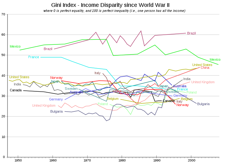
Reference: Wikipedia
The Gini coefficient is useful in pursuit of the answer to this question. It is not known by this author how uniform the income distribution is in various countries, so the analysis is therefore a bit qualitative and not completely quantitative.
The graph at right is a display of a good many countries. The ones at the lower levels around 20 to 30 percent are suffering from socialism or the after effects of being communistic.
Countries like Canada, the USA, Germany are in the 30 to 40% area until the 1990's when the USA rose above to above 40%. Countries like Brazil and Mexico do not have free market but rather an elite group who has been benefiting from such policies as nationalized oil companies.
What is also interesting in this grouping is the rise of China and India as they move from a weak developing country to a strong one.
The decline in Gini for France and Italy also comes at a time when their economies experience less growth and a falling behind in international economic status.
Is there an ideal Gini coefficient? The answer can clearly be no. If the economy is growing and very dynamic the Gini coefficient can rise and fall in several decades.
The difference between 30% and 45% is significant on this scale. Any rapid change in this parameter should raise some questions, not necessarily concerns. If 1 country has a Gini 15 percentage points higher than another, it could very well mean that innovators are succeeding. It could also mean for another country that markets are controlled by government.
Conclusions and Other insights on income
distribution
Percent of Households With:
Reference: Stats
What we have discovered in this section/Chapter is that numbers with understanding does matter. The rich are getting richer, but everyone is getting richer with few exceptions. Consumption equality (a central topic of the next Chapter) is real.
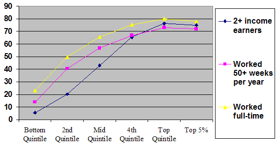
In this time period (since the 60's) a larger and large portion of the economy was based on skill-based activity and being globally competitive. The need for an education is clear both from a conceptual view and from data analysis. The social construct of having a solid household and a healthy productive career are also very apparent. The graph at right summarizes the effects of working longer hours, etc. The rich work longer hours, have more income earners in a household and are in a position to hold full-time work longer.
There are a good many forces acting on society during this time period that are essential to identify and catalog before we draw conclusions.
The implications of concerns over income distribution reach far and wide in policy framing at all levels at the moment. In discussions with knowledgeable folks (Reason Weekend 2012), the concerns for inequality is being used to frame policies of control not those of free societies. As we see above, unfree societies can have very low GDP growth and even low or high Gini. A high Gini value can be a good indicator of a country having a severe case of cronyism, where some benefit due to force.
Turning to a few other opinions:
From Reason.
We’ve all heard the line about “lies, damned lies, and statistics” (though we don’t know who first said it), and we’ve been warned that “if you torture the data enough, they will confess anything.”
Does the Gini value for our country show an indication of
stronger inequality lately?
Not according to the Census Bureau. As summarized by Mark Perry:
According to three different Census Bureau measures [including two that use the Gini Coefficient], income inequality in America increased only gradually from the 1960s through the mid-1990s, but since then has remained relatively constant. Therefore, the factual record of income data in the United States certainly doesn’t support the claims that income inequality has “exploded” recently. A more accurate description of income inequality over the last several decades would be to say that it “flat-lined” starting in about 1994. [Emphasis added.]
This link delves into the philosophical and ethnic and ethical
considerations in dealing with perceived inequality:
Link.
But doesn't equal and growing opportunity matter most?
Link.
Conservatives and libertarians such as economist Thomas Sowell, and Congressman Paul Ryan (R., Wisc.) argue that more important than the level of equality or inequality is America's equality of opportunity, especially relative to other developed countries such as western Europe. Strong economic mobility means both that (a) a high level of inequality of annual income is made irrelevant by the even distribution of lifetime income, and (b) however extreme the earnings at the top, they are not out of reach for the poor (or middle income) but ambitious.[11]
Sowell suggests that many discussions of income equality ignore
fluctuations in income and social mobility.
An absolute majority of the people who were in the bottom 20 percent [of income] in 1975 have also been in the top 20 percent at some time since then. Most Americans don't stay put in any income bracket. At different times, they are both "rich" and "poor" -- as these terms are recklessly thrown around in the media. [...] There are of course some people who remain permanently in the bottom 20 percent. But such people constitute less than one percent of the American population, according to data published by the Federal Reserve Bank of Dallas in its 1995 annual report. Perhaps the intelligentsia and the politicians have been too busy waxing indignant to be bothered by anything so mundane as facts.[12]
According to Thomas A. Garrett, studies examining quintiles of wealth levels may provide a misleading picture. [35] For example, a U.S. Treasury study of the period from 1996 to 2005 found that "[l]ess than half (40 percent or 43 percent depending on the measure) of those in the top 1 percent in 1996 were still in the top 1 percent in 2005. Only about 25 percent of the individuals in the top 1/100th percent in 1996 remained in the top 1/100th percent in 2005."[136]
Authors go on to say that Saez, Krugman dispute these findings.
Is equal opportunity more important than equal outcome? -
isn't that the key issue here?